With the COVID-19 pandemic, seminars have shifted online and webinars have been the norm for many since then. This prevalence has exposed multiple issues with the webinar format. This coincides with the module I took called NM2213 Introduction to User Experience, where we are tasked to design a desktop video conferencing application. For the project, my group decided to discover and solve such issues. Throughout, we discovered that gauging audience engagement and managing presentation tools were key problems. We sought out to develop our solution, Slife, to solve these problems. Our process is detailed below.
For the project, we decided to design a desktop video conferencing app tailor made for webinar use. This means targeting our feature set for webinar users; we decided to focus squarely on the speakers.
Our team had 3 members(myself, Jolyn and Shing Yee) sharing the workload. My personal role includes spearheading the team for both user research and design, doing my share of interviewing and usability testing as well as designing of the screens.
We had the following constraints that stem from the module itself:
To find out more about the problem space, we did some preliminary desk research followed by carrying out a total of 6 user interviews. From our preliminary desk research, we found out there are multiple types of webinars. Of which we decided to narrow our scope to education/keynote type webinars where the speaker educates the audience about a subject.
We recruited our interviewees according to this narrowed scope, doing 3 user interviews each for webinar speakers and audience. This allows to gain insight on key pain points faced by both parties.
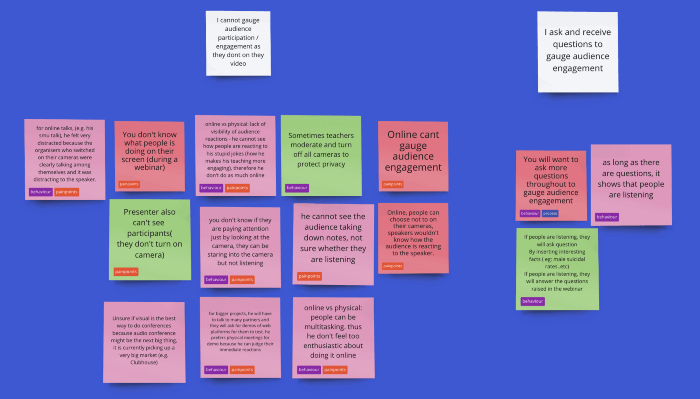
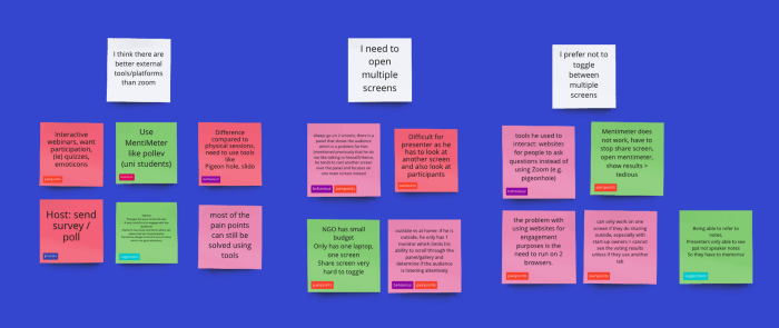
For the user interviews when exploring the problem space, we synthesised our findings with an affinity map each for speakers and audience. These revealed key insights, including:
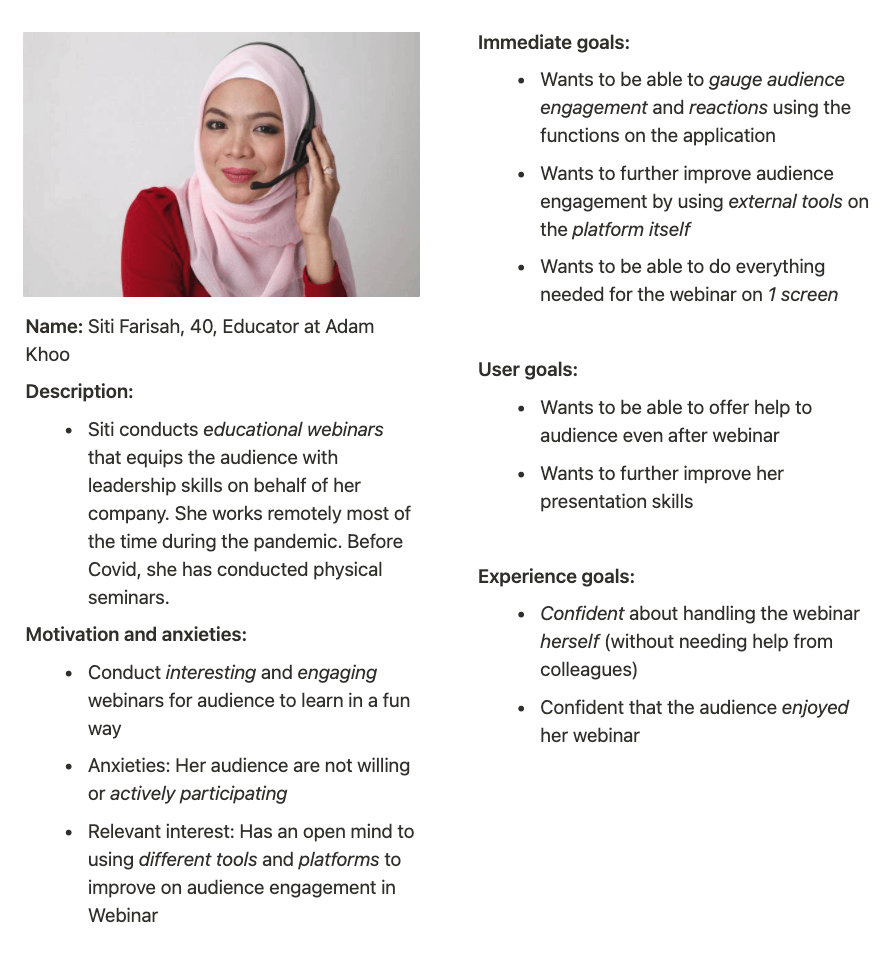
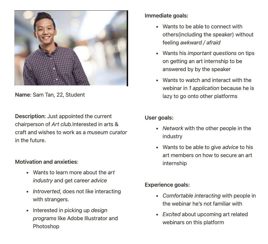
We generated 2 personas based on the i-statements for future use as well.
Left: Farisah, an amalgamation of our speaker interviewees. Right: Sam, an amalgamation of our audience interviewees
From the insights gained from our research, we were able to define possible problems to solve for the project. This led to us generating 3 main problem statements(in the form of user need statements):
We then decided to narrow our scope due to limited time constraint and focus on solving the speaker’s problems instead of both the speaker and the audience. Namely problems 1 and 2.
Based on the 2 problem statements we then made a mind map to ideate for possible solutions. We also have a specific branch of the mind map called “Worst Possible Ideas”. It allows us to get our worst ideas out of the way and the creative juices flowing.
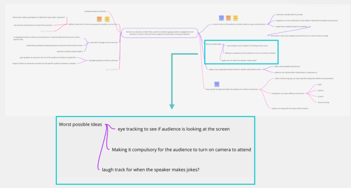
We voted on our ideas and settled on 3 main ones:
Initial designs for slide actions can be seen below, such as setting up a poll to be sent out upon reaching a slide:
And what it looks like during the webinar itself:
Initial designs for emoji requests can be seen below, such as setting up an emoji request to be sent out upon reaching a slide:
And what it looks like during the webinar itself:

We carried out usability testing with 3 speakers and validated our solutions as helping to solve the problems we have chosen. However, this also exposed 2 main issues with the design.
Before: There is both a confirm and done button. The confirm button is to finalise the slide action(poll) added to the specific slide. The done button is used for finalising slide actions added for all slides.
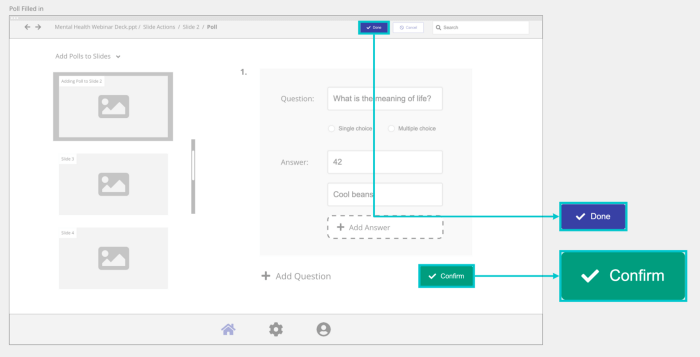
What’s wrong: From our testing, after confirming, users do not know that they have to click “Done” to end the add polls action and move onto other actions
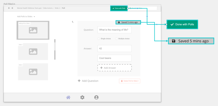
After: This was fixed by doing without the extra done button by having an autosave feature for the local changes for that specific automated action.
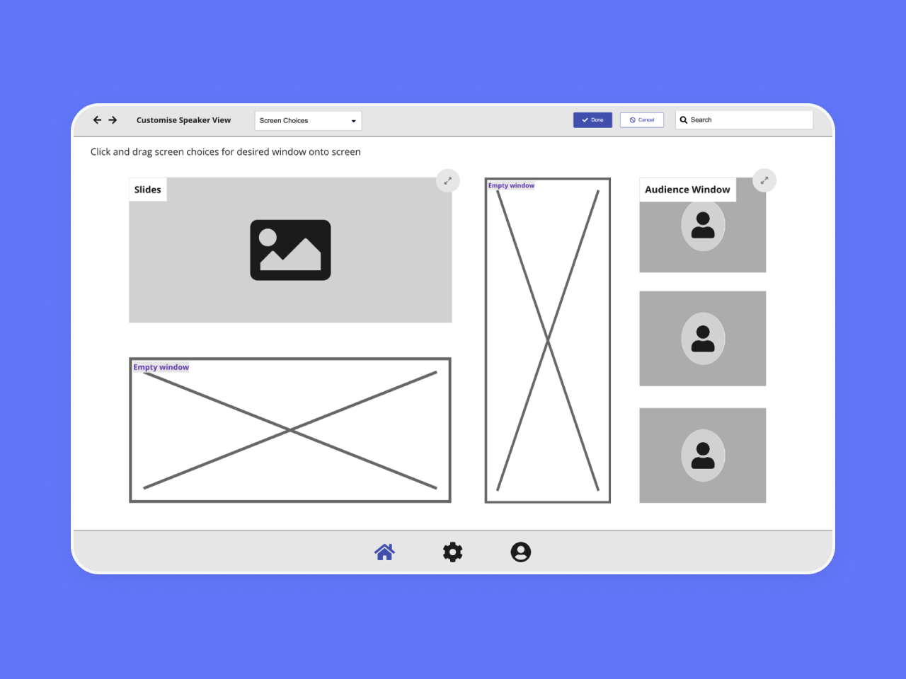
Before: There was a one liner instruction: “Click and drag screen choices for desired window onto screen” to guide the user into accessing a dropdown containing possible screen choices. These screen choices can be dragged into the empty window to fill its space.
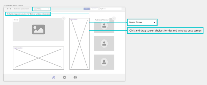
What’s wrong: The instruction was confusing to the user and they did not understand it. In fact, the users also did not understand what the term “Screen Choices” meant and thus whats inside the dropdown menu.
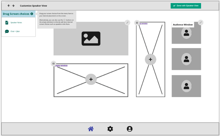
After: Instead of having a dropdown, we pinned the choices as an always visible sidebar. Next to it is an “i” icon that on hover reveals an information tooltip for further explanation. There is also a plus button for empty spaces to also add the screen choice in the empty space itself. This addresses the problem of unclear instructions and users inability to locate screen choices with the drop-down menu previously.
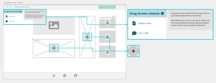
We carried out a heuristic evaluation for the prototype as well. We utilised Jacob Nielsen’s 10 Usability Heuristics as a basis to evaluate this newer version of the prototype.
In general, we feel that the revised prototype is user friendly for the most part. However, more work can be done to allow the user to have more control and freedom and not let them go through an extended dialogue to leave the unwanted state i.e. have more recovery actions.

The final solution is called Slife (Slide + Life). It consists of 3 main features:
The finalised interactions are shown below for each feature.
Speakers can add a slide action, for example a poll, to be sent to audiences at slide 2
Upon reaching slide 2 during the webinar, speakers can send out the slide action set up to the audience to interact with. Results are received and speakers can choose to display it to the audience too. (no changes from initial design)
Speakers can add a slide action, in this case an Emoji Request, to be sent to audiences at slide 2
Upon reaching slide 1, emoji requests can be sent out to audience. Feedback is received by the speaker allowing them to adjust their performance. (no changes from initial design)
Overall, we produced a relatively interesting solution for the problem statement provided which also has been validated via usability testing. We did our due diligence for each step even with limited time.
There is definitely room for improvement, such as doing:
To end off, the main lesson learnt was that it is completely okay to not decide on an exact problem and target audience, the final decision can be made after exploring the problem space.
