
We noticed the following main problems amongst youths with regards to personal finances:
There are existing solutions such as Seedly and Bank Apps that help to monitor their users’ expenses. It also categorizes these expenses accordingly.
However these do not cater to a younger audience who lack the discipline to use the application consistently.
Our Solution, called PetSaver, is a mobile application that makes saving fun for young adults and teenagers in a tamogotchi-inspired gamified package.
Targeted User Groups:
Our overall process can be seen below:
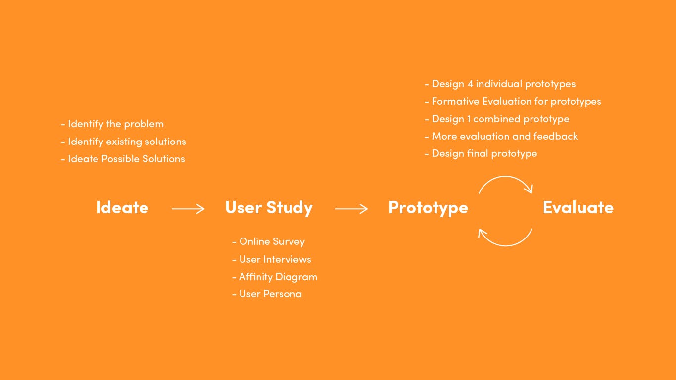
Process for the project
We carried out an online survey as well as user interviews to find out more about the financial literacy problem amongst youths. Details are as follows:
Online Survey
User Interviews
We gathered our findings and organised the various ideas into groups or themes based on their relationship via affinity mapping.
Affinity map elicit themes related to cashflow, reasons against PetSaver, competition, bad habits, saving practices, app expectations and pull factors and more.
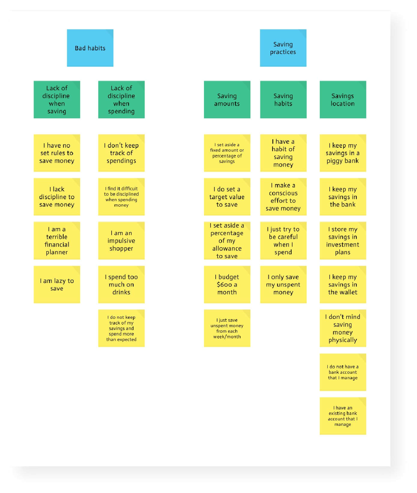
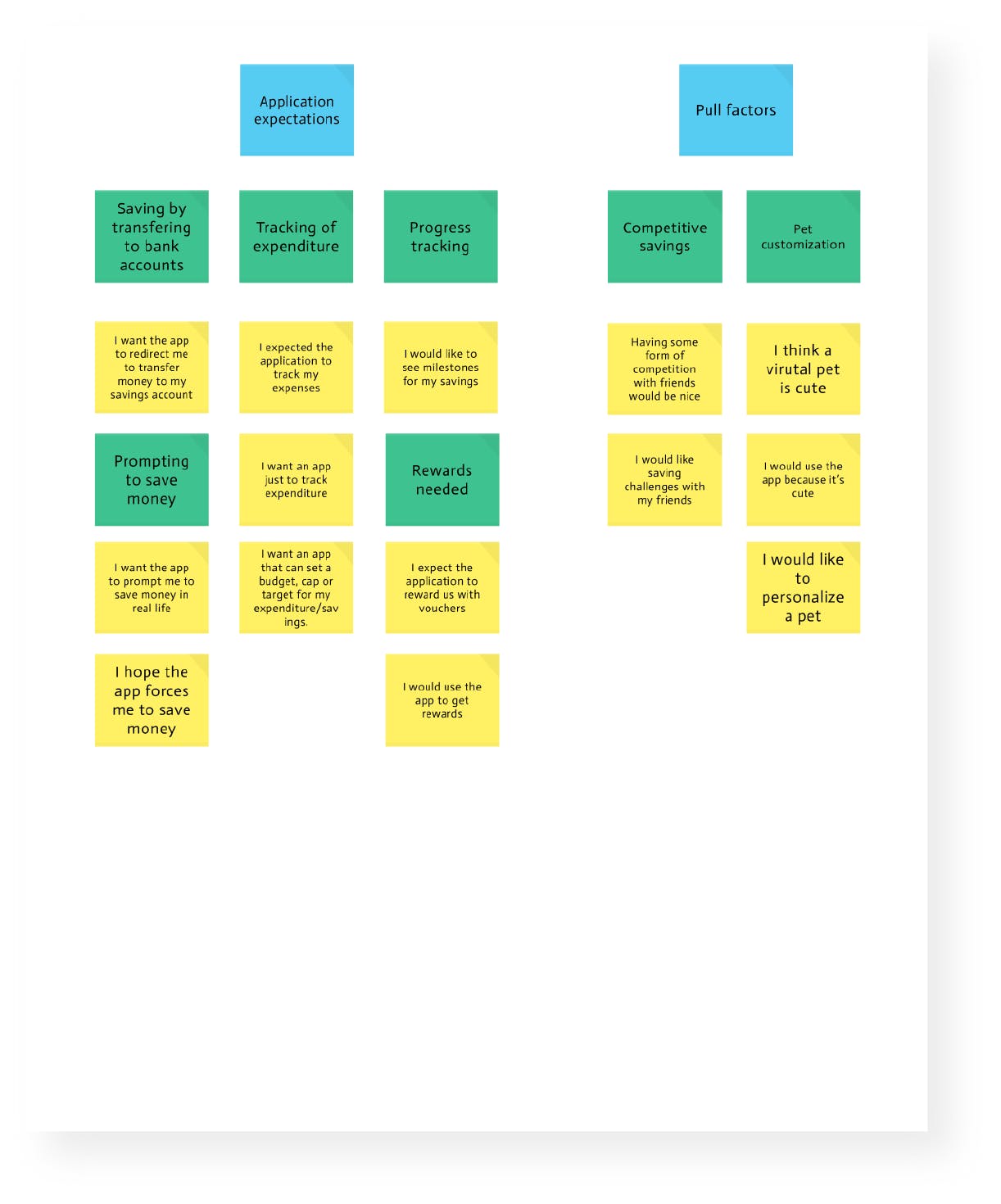
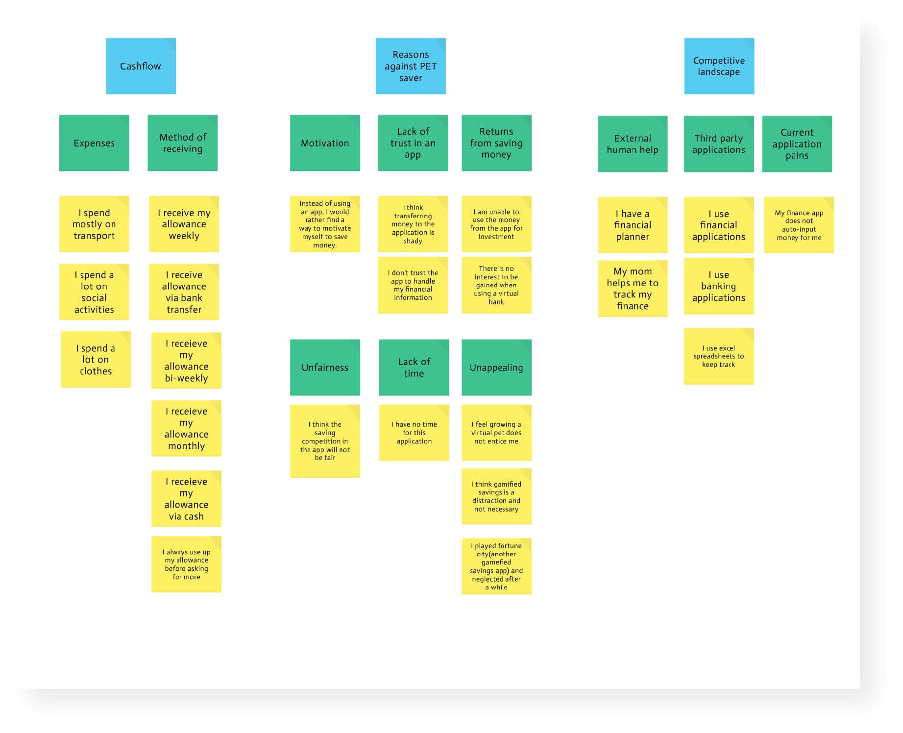
Actionable steps:
We distilled our findings and generated 2 user personas based on the common needs of our target user groups. This helped us focus on keeping the user's needs in mind.
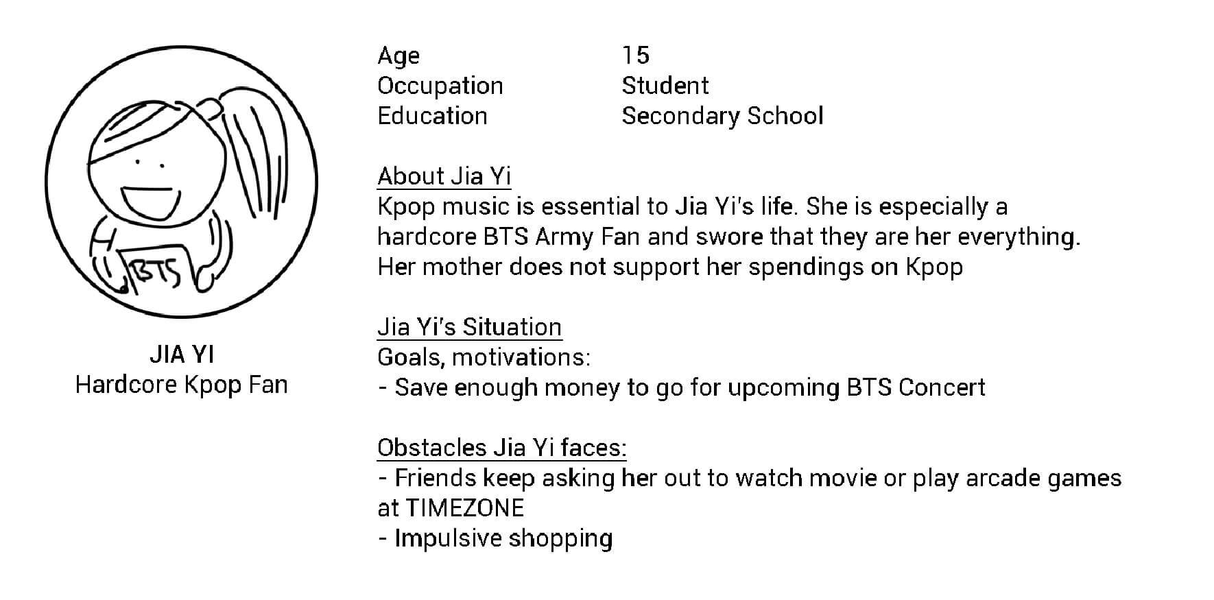
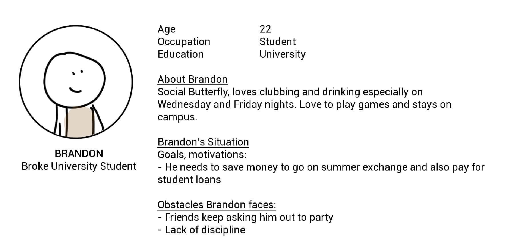
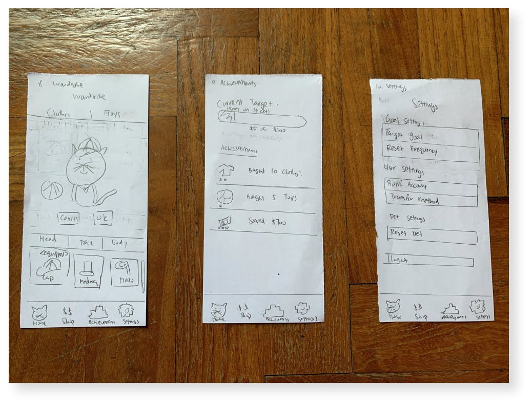
We all set out to make our own individual prototypes based on our own ideas on what the PetSaver app should be. This resulted in a mix of low and high fidelity prototypes with emphasis on different features.
We had a total of 6 users using each iteration of PetSaver. They tested the product using the concurrent think aloud approach, allowing us to gather their thoughts while doing a certain task.

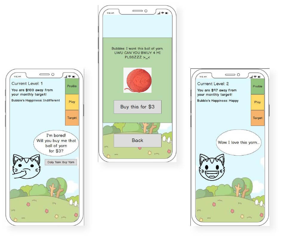
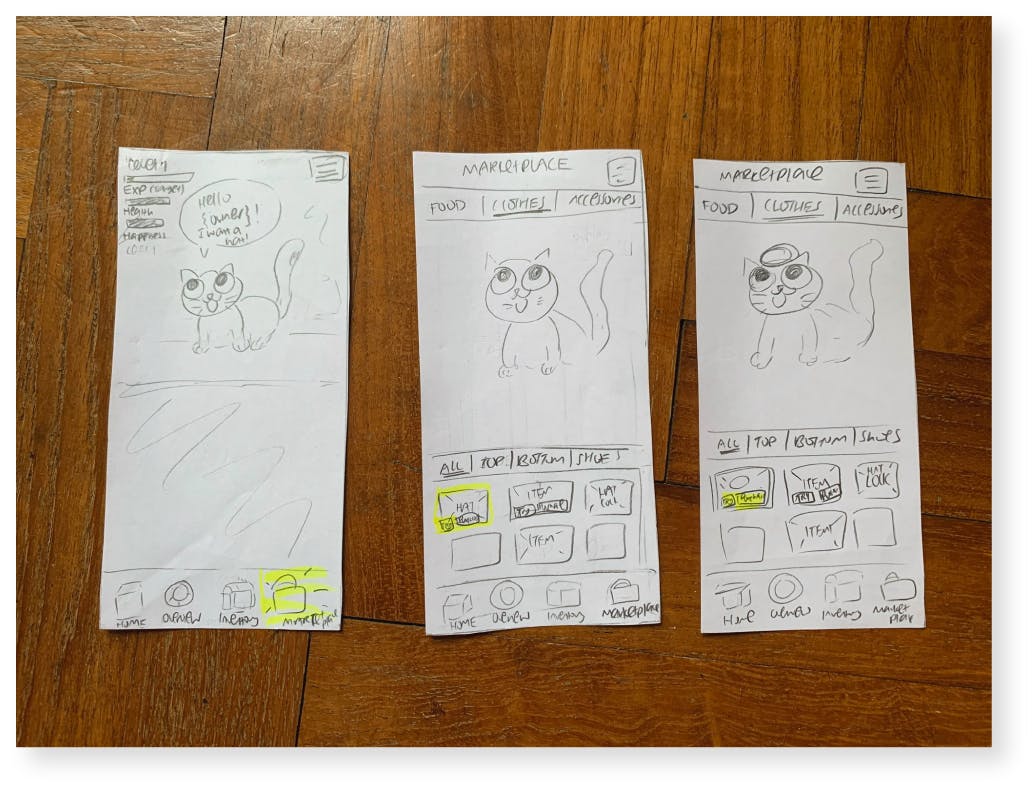
After the evaluation and feedback from the user testing, we discussed on the design by coming up with the colour scheme and multiple mock ups, we worked on these pages using Figma.

Key screens for version 1
Had screens for all the interactions with the pet, including patting, buying food and dressing the pet. When food is bought, it is actually a transferral of money from the user’s expenses account to savings account. There are statistics for users to track their savings, leaderboard for the users to compete with friends and achievements to further incentivise users.

Key screens for version 1
The project was my first true taste going through the entire design thinking process. On the research side, I wasn't fully sure at the time whether we were doing enough research and whether we were doing it correctly. Looking back, I realise now that our user study was flawed as instead of discovering the problem space, we had preconceived notions in mind that we were trying to reaffirm instead. This big mistake was something I kept in mind in future UX projects.
Overall, it was a good learning experience and major thanks to my teammates Darren, Amabel and Meiyen for working on this together. An infographic version on behance of this case study can be seen here.
We also made a promotional video for the module, feel free to watch it below:
