


Arthur Lee
Product designer;
Menu
Work
Work
Get in touch!
For the module NM3221 Mobile Interaction Design, I wanted to work on a project that I could deem worthy enough for my portfolio. As the project could be about anything, I aimed to solve a problem I face myself, namely a phenomenon called “Doom Scrolling”. It went through the process seen in the diagram below, covering research to design.

According to Merriam Webster, Doom Scrolling refers to the tendency to continue to surf or scroll through bad news, even though that news is saddening, disheartening, or depressing. Therefore the central design problem becomes:
How might we address doom scrolling in the local context of Singapore
To hone in on the exact problem faced by locals in Singapore, desk research and user interviews were carried out.
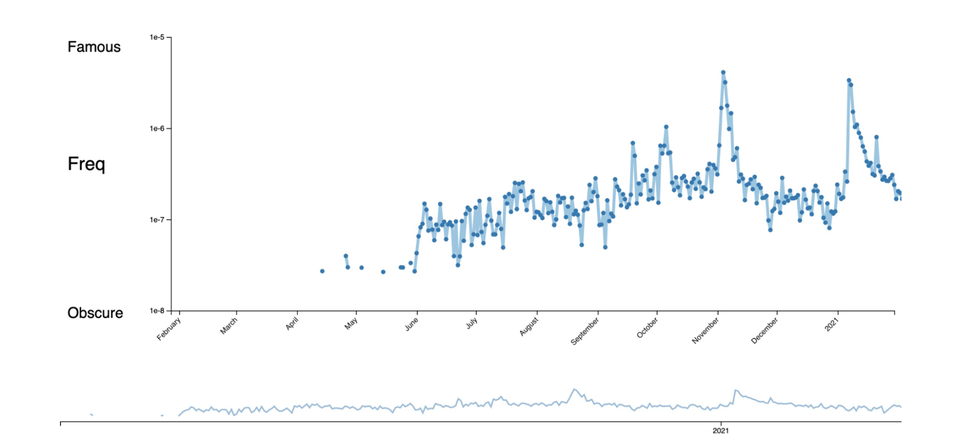
The initial desk research helped to shed light on how Doom Scrolling as a term has gained traction especially with the onset of COVID-19. It hit its peak in November 2020 as seen in the graph below.
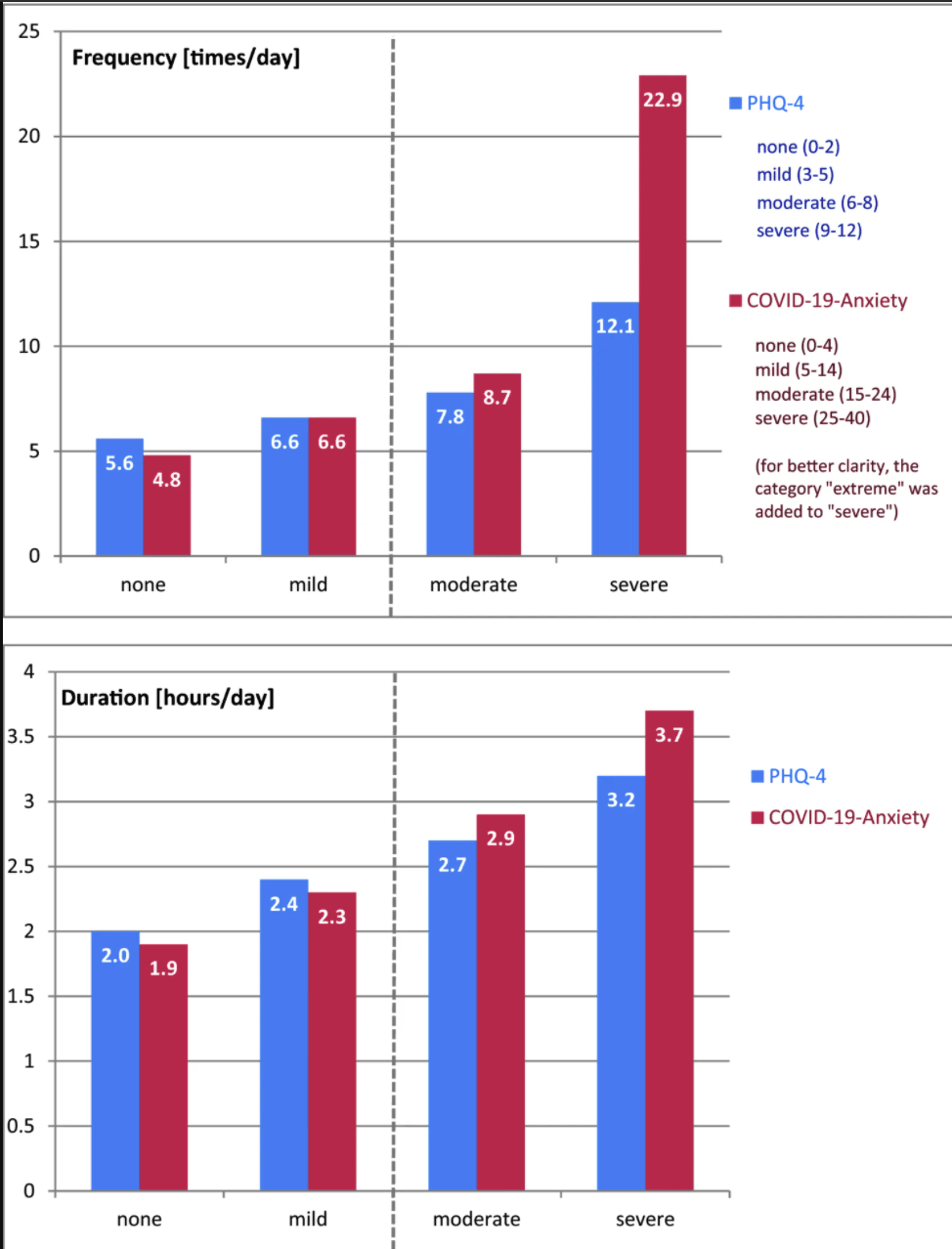
In fact there is a correlation between the number of times or the hours spent looking at negative news such as COVID-19 news and the severity of unspecific anxiety and depressive symptoms (PHQ-4) and COVID-19 related anxiety as shown below.
To get a sense of the local context, I conducted remote semi-structured interviews to collect the qualitative data. These interviews were conducted with Singaporeans/Permanent Residents to provide this local context, who are also Millennials or borderline Gen Z young adults. This is due to the fact that these groups are well connected with social media and thus more likely to engage in doom scrolling.
The research goal being “Find out about users’ experience with doom scrolling in their current context(especially in COVID-19 context).”
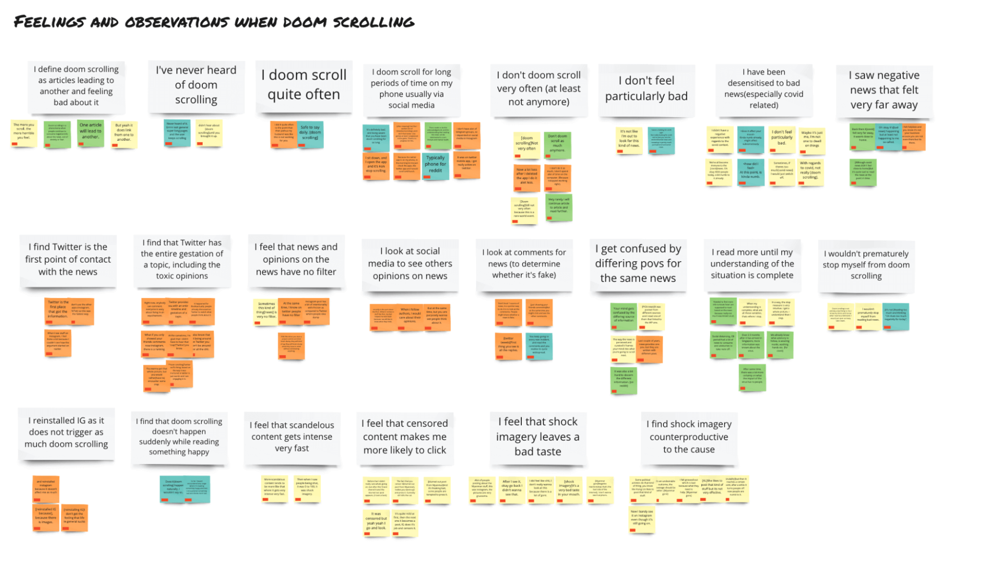
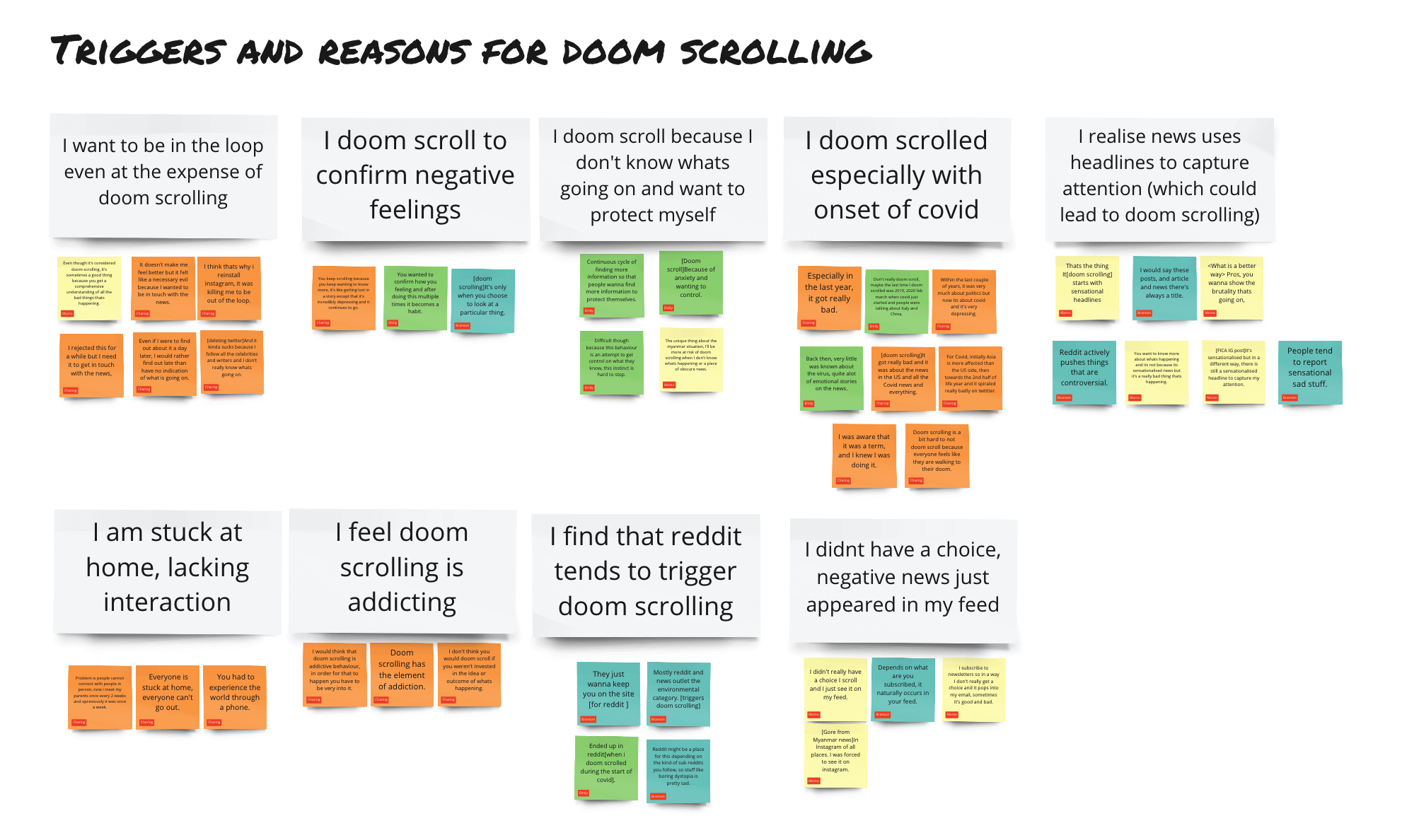
The qualitative interview data was processed via affinity mapping as seen below.
Legend: The different colours for the Post-Its represent different participants, therefore the stronger themes are those with multiple colours.

After going through all the research, I realised that there is a constant influx of negative news, especially those stemming from the pandemic. This promotes the act of doom scrolling. Furthermore, with the insights gained from the interviews done, it is clear that doom scrolling is a problem, although the term has not been popularised in Singapore yet. It also brings to light issues with regards to how news is conveyed, through narratives that aim to tap on emotions of the reader instead of always providing the facts in a neutral manner.
This updates the previously mentioned central design problem to:
How might we address doom scrolling and its negative effects on mental health while still keeping people informed.
This gives rise to 3 separate problem statements that tackle different aspects of the central design problem.
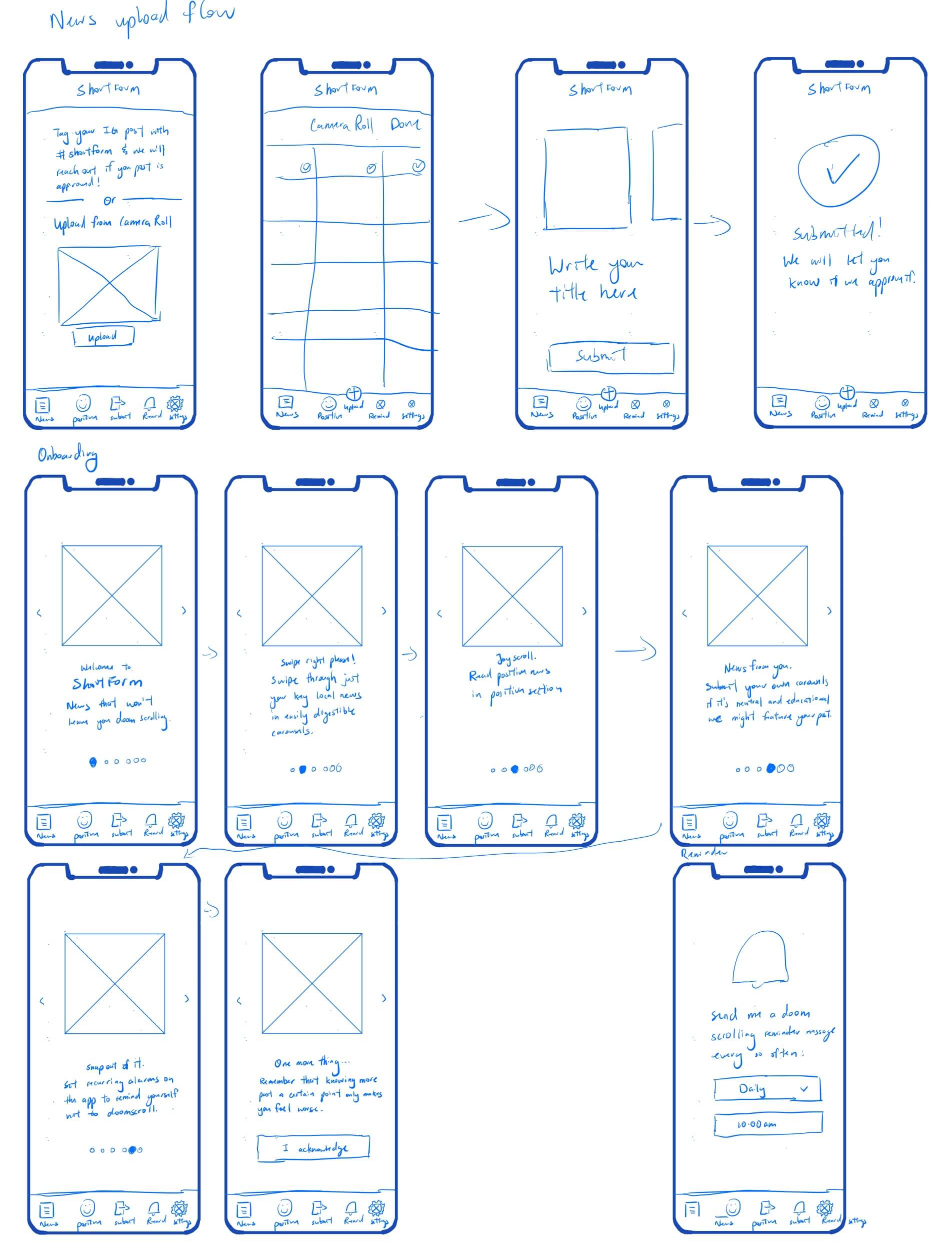
The next step was to start ideating to solve the 3 problem statements mentioned before. This was done via doing possible sketches on what the key functionalities would be. These sketches can be seen below.
Ideation sketches were done to plan out key user flows for the application and solve for the 3 problem statements.

After ideating via multiple sketches as seen above, a few key functionalities were decided on.
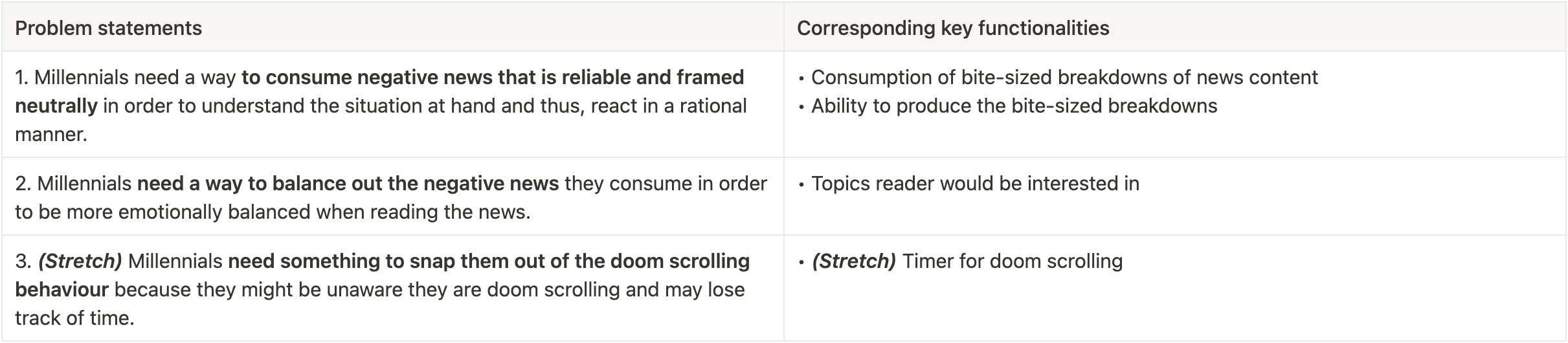
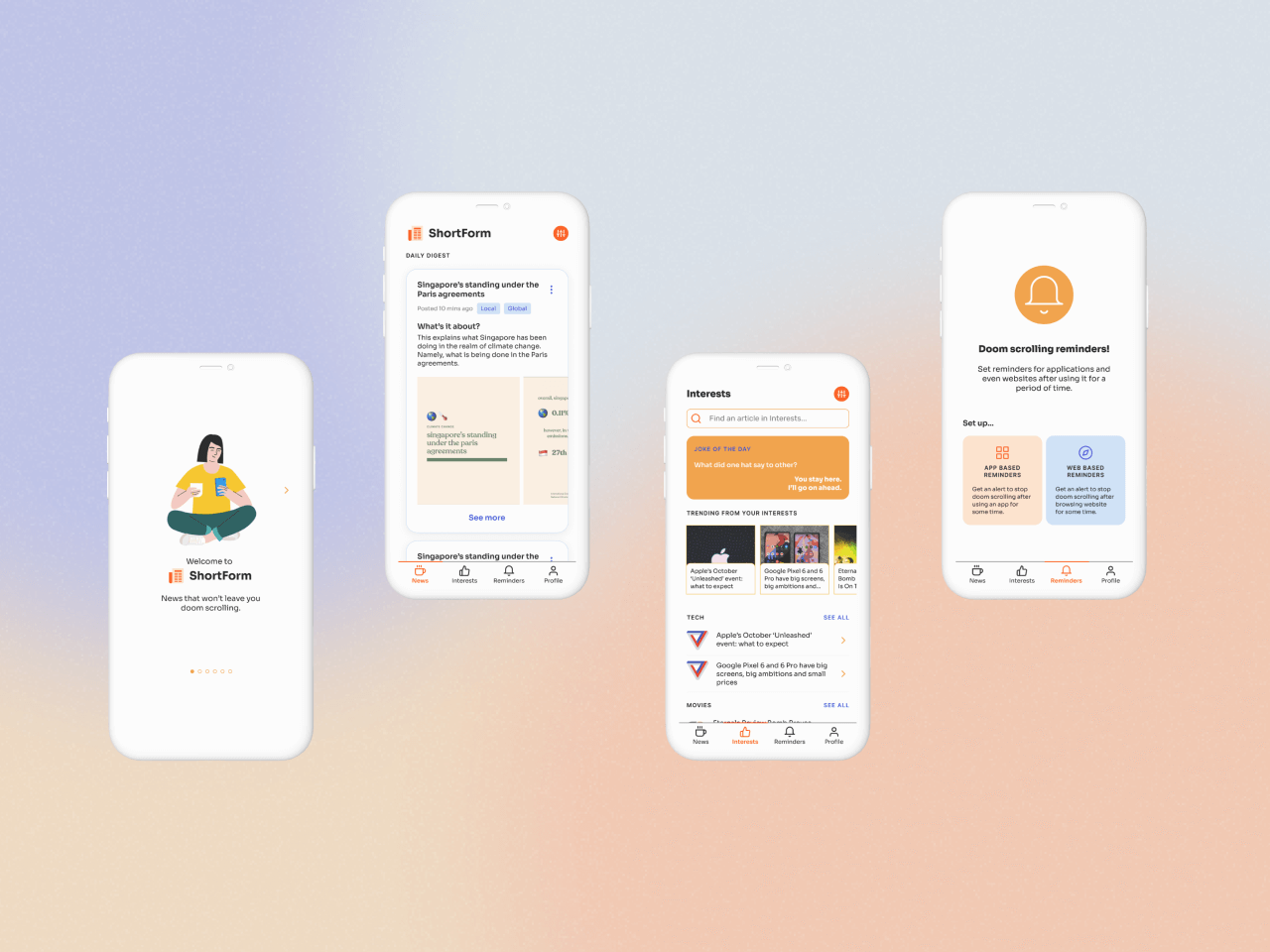
The app name was also decided to be “ShortForm” due to the key feature of producing the bite sized breakdowns of news.
Carousels to break down news, example taken from vocallocals.co on Instagram
It’s one of the square Instagram posts. Then it breaks down the info and links to WP Instagram and they wrote a statement about their objection and I found it very informative.
— interviewee
Inspired by the Instagram carousel, this feature aims to present news information in a manner that is easily digestible. This is done by having smaller blocks of text and accompanying graphical elements in each image. This content is meant to be vetted through so as to ensure it is as neutral and educational as possible.
This part of the solution aims to orientate the reader as fast as possible as to what the facts are. The faster the reader understands the situation, the more likely they would be to have a rational reaction.

In order to accommodate the creation of such news carousels, a user flow was created to do such that. This was envisioned to be done either on the application itself via uploading the images or could be linked directly to an existing Instagram post via a specific hashtag. This was done in an attempt to reduce the barrier of uploading such content on the platform.
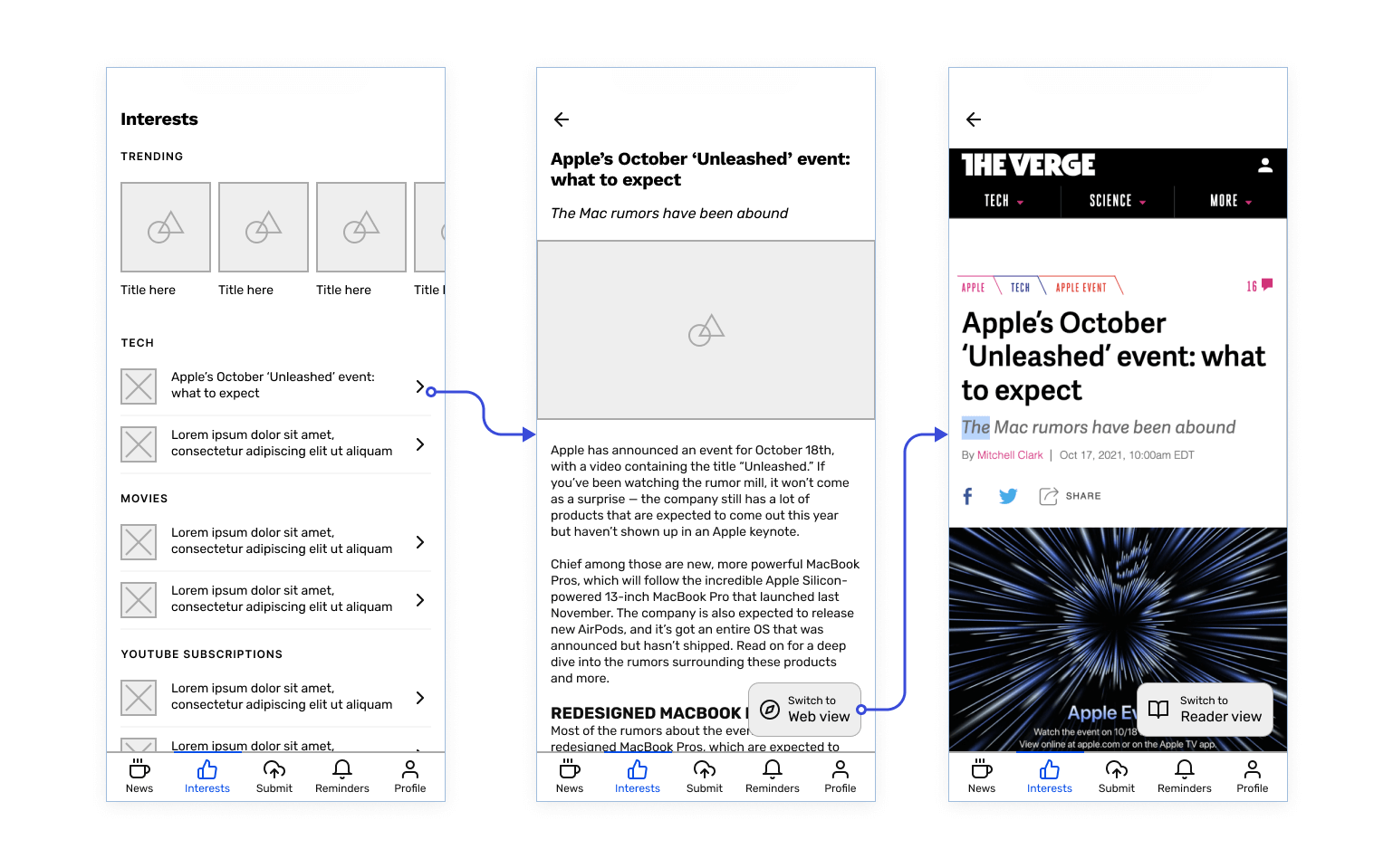
To counter the negative news that could arise from current events, a dedicated section of the application would be positive and interesting news that the user could configure. This directly targets the 2nd problem statement mentioned earlier. Tapping on an article would lead to reading the article in an in-app web browser, with a reader mode that simplifies the layout and just shows the content of the article itself.
The 3rd problem statement was that millennials needed something to snap them out of their doom scrolling. This feature would be a simple timer that sends out a push notification to the user to remind them to stop scrolling after the time is up. This feature was labeled as a stretch feature as I initially thought I only had capacity to work on the first 2 problem statements.
With the low fidelity prototype made, it was evaluated via a remote moderated prototype test. The focus being evaluating the concept of the app instead of its usability. The research goal thus was “Find out whether millennials who have doom scrolled before are receptive to solutions presented to prevent doom scrolling or (in the case of the alarm) stop doom scrolling.”
Notable results will be presented alongside its changes to create the mid fidelity prototype.

From the low fidelity prototype, there was feedback that users may still continue to read more. The main reason being that they want to corroborate what they are reading currently, which could lead to doom scrolling as they read more and more. Therefore, the news carousel will be repackaged to be prepared by the hypothetical ShortForm Company with the last slide showing the sources that have been used. This signals that it was consolidated and corroborated from multiple sources already and would reduce the need to look for more perspectives on the issue.
Users also gave feedback that submitting the news via uploading images or using Instagram is something they would rarely do. Therefore this feature has been removed from the bottom navigation and moved to the profile section.

Furthermore, one of the participants gave the insight that they initially thought it would be to submit news article links instead. This reduces the friction in contributing to news. It also influenced the decision to make the news carousel something that the hypothetical company would generate.
Bottom drawer to configure topics for both News and Interests
A piece of feedback for both News and Interests was to configure the different sources and topics. This configuration can be done by tapping the filters/plus button to bring up a bottom drawer to configure the topics. This configuration of topics also appear in the onboarding flow.
Another piece of feedback was that the participants wanted more control as to what news was shown to them. On top of configuring the topics, the ability to indicate whether they would want more or less of that specific type of content was another way to empower users to curate their content. This feature is present for content in both the News and Interests section of the app.
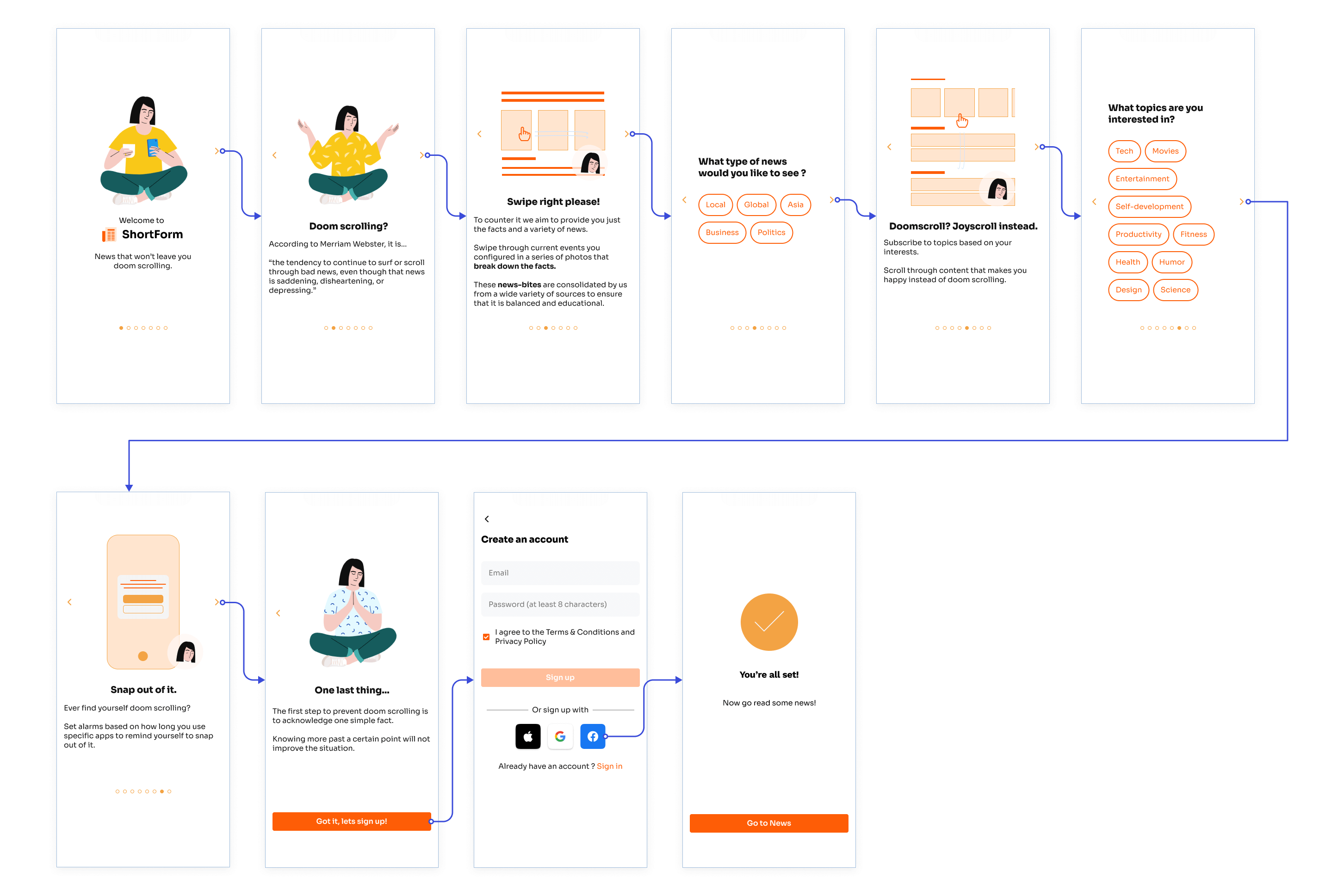
After creating the mid fidelity prototype, I carried out a heuristic evaluation based on the Nielsen Norman usability heuristics. Based on heuristics violated, changes were made to create the first iteration of the high fidelity prototype.
Updated onboarding flow with visuals
One of the problems in the earlier iterations was that there was some inconsistency for the terminology for the news carousel. In fact that the term news carousel counts as internal jargon, violating the 2nd Nielsen Norman heuristic, match between system and the real world. So to consolidate the terminology, although not perfect the name “News-bite” was used to describe the carousel moving forward.
Furthermore, the visuals for the onboarding were also fleshed out to aid in priming new users on what to expect for the app. This was vital to have in this iteration as it would help onboard participants for the upcoming usability test.
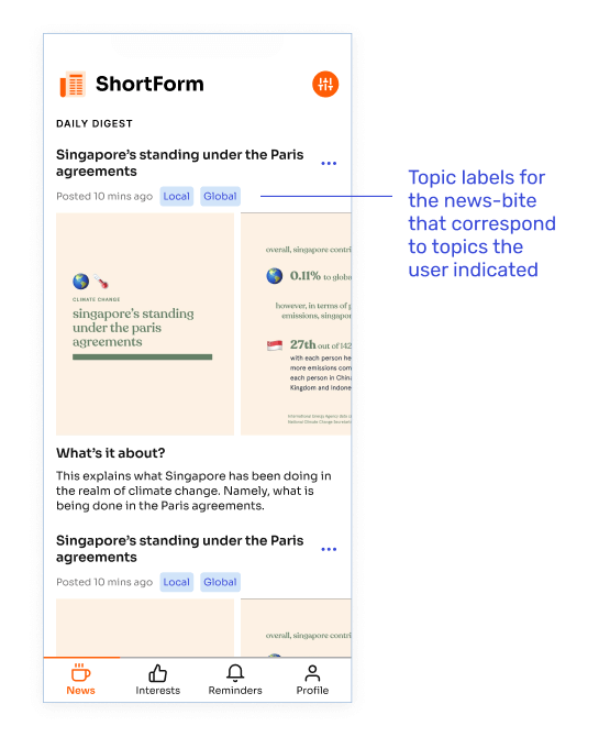
As users are able to configure topics they would like to see in the news section, labels would communicate clearly to users which topic the news-bite is from. This is in line with the visibility of system status heuristic.
The first high fidelity prototype was used for a round of usability testing. It was done remotely and moderated, with specific scenarios and tasks for participants to complete. The focus was on evaluating how usable the app is and whether participants are able to do what they set out to do.
In fact here is the link to the Figma prototype, feel free to play with it 🤗. I’ll be linking the corresponding flows in the upcoming sections.

Shortened onboarding flow, previously was 8 steps now it’s 6 steps
A piece of feedback was that the onboarding flow previously had way too many steps. Therefore the onboarding flow has been shortened from 8 to 6 steps. This is done by offloading the topic selection for news and interests to the first time users would access the 2 screens. This also helps the users form the right mental model as to which topics correspond to the News or Interests tab, which was a point of confusion found in the usability test as well.
Link to onboarding flow on Figma prototype.
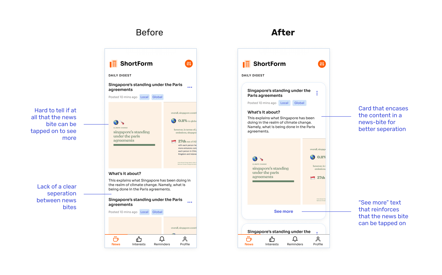
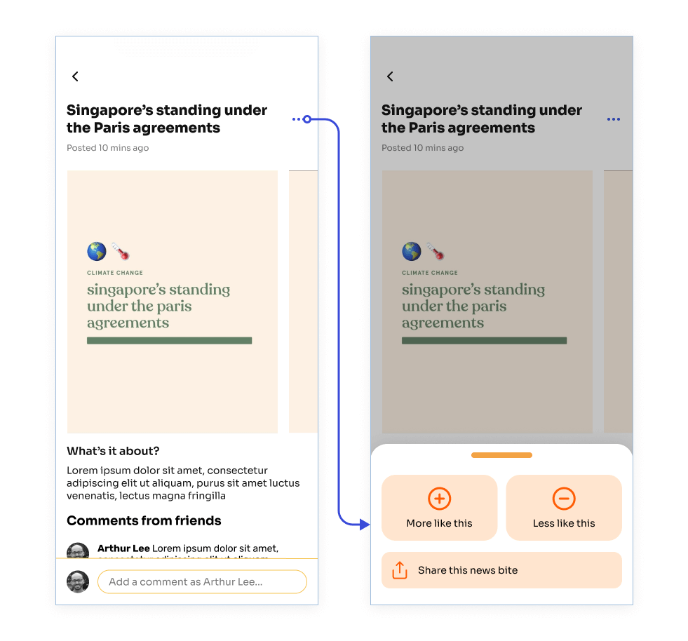
A piece of feedback from the usability test was that participants did not know that they could tap the news bite to find out more. They only focused on swiping through the carousel of images. Furthermore, the separation between the news bites in the home page was not clear enough.
This visual treatment and the “See more” copy makes it extra explicit that the user can click into the news bite to find out more whereas the previous design was not as clear. This also addresses the concern for visual separation between news bites as each card houses 1 news-bite and there is sufficient spacing between the cards.
Another piece of feedback received was that a participant had the mental model that they are able to click to expand the images into full screen. This flow was thus accounted for in the final prototype.
Link to News flow on Figma prototype.
One of the participants gave feedback that the floating button to switch between reader and web views would block the text, becoming a source of annoyance for the user. There were 2 possible solutions to such an option. One of which took inspiration from Flipboard where the top bar housed a switch to allow the user to toggle between reader and web mode. However, as it is housed in the top bar it would be hard to reach, especially one handed.
Therefore, the second solution was used instead. On scroll the the top and bottom bars(including the floating button) would disappear. Scrolling the top would reveal these top and bottom bars again. This allows the floating button to remain at its ergonomic bottom position while not obstructing the text as the user decides to read more.
Link to Interests flow on Figma prototype.
A new feature that is being introduced is the notion of web reminders. As participants across the prototype test and the usability test have expressed interest this feature was explored. It works by having the user add websites via URL that are considered negative in nature and after a user-specified period of time, the doom scrolling notification would appear. This feature is enabled by iOS15’s Safari extensions.
One issue to note is that one of the participants in the prototype test was heavily against the feature due to the fact that the application would have an opinion on what websites are considered toxic or not. Therefore to address this issue, the app will give users control on what websites are considered toxic(via a blacklist) and thus would receive a doom scrolling reminder.

Set up flows for app reminders and web reminders
The reminders page thus has been updated to reflect the presence of both types of reminders with a tabbed design to separate existing app and web reminders.
Link to the Reminders flow,
Web reminder example and the unrelated
Profile flow for contributing news links on the Figma prototype.
Looking back, I’ve managed to hone my craft for both research and design.
All in all, there were definitely difficulties encountered along the way but I really enjoyed tackling this problem. I felt I made effective use of my ability to manipulate the form to create a solution that addresses the central design problem of addressing the negative behaviour of doom scrolling.
A huge thank you to everyone who helped me in particular Professor Dennis Ang and the participants for user research.
Thanks for reading thus far! Do get in touch with me on LinkedIn for any kind of feedback, suggestions or collaborations!
